UAEYC 50th Anniversary Statewide Conference
TL;DR
Client: Utah Association for the Education of Young Children (UAEYC)
The Problem: Fragmented visual identity for a legacy 50-year-old statewide conference.
The Solution: A unified, professional-grade system of 20+ digital and physical deliverables.
Key Results: Increased brand trust, multi-year durability for signage, and 100% accessible schedule design.
Case Study: Building a Statewide Visual Ecosystem
Brand Iteration, Original Sub-Branding, & Environmental Design for UAEYC
The Challenge
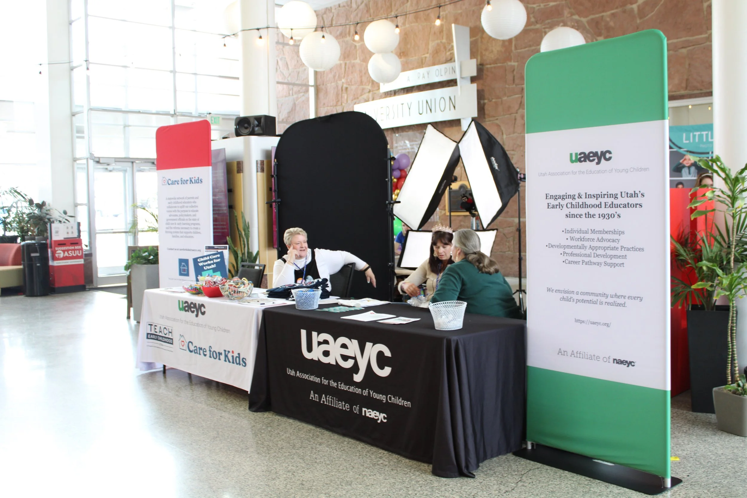
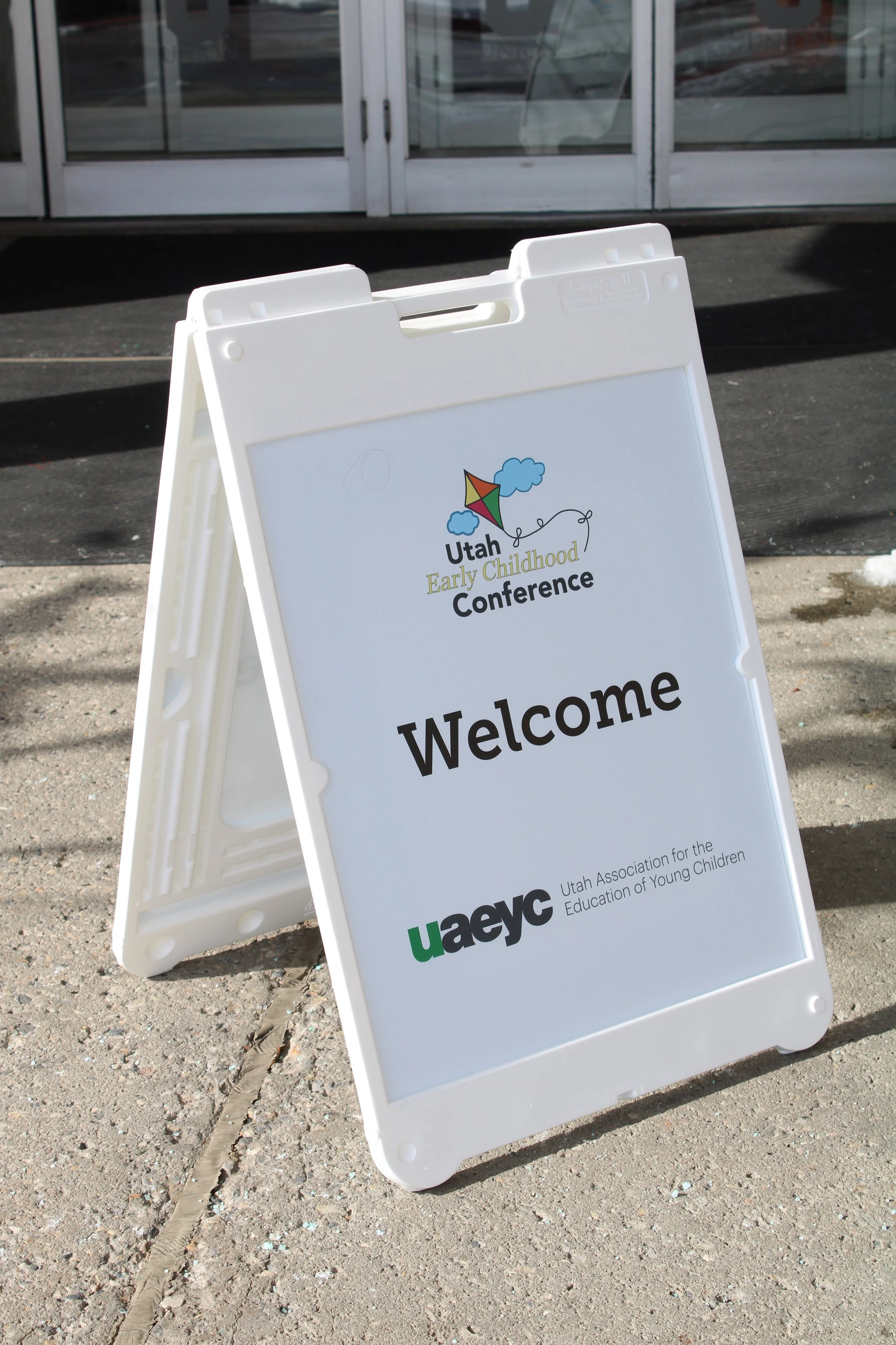
For half a century, the Utah Association for the Education of Young Children (UAEYC) has hosted a premier statewide conference for thousands of educators. In 2025, I was contracted to modernize their visual presence for their landmark 50th Anniversary, replacing outdated, "DIY" materials with an elevated system that reflected the association's prestige.
The Mission: Iterate on a 50-year-old brand to create a "professional yet playful" atmosphere.
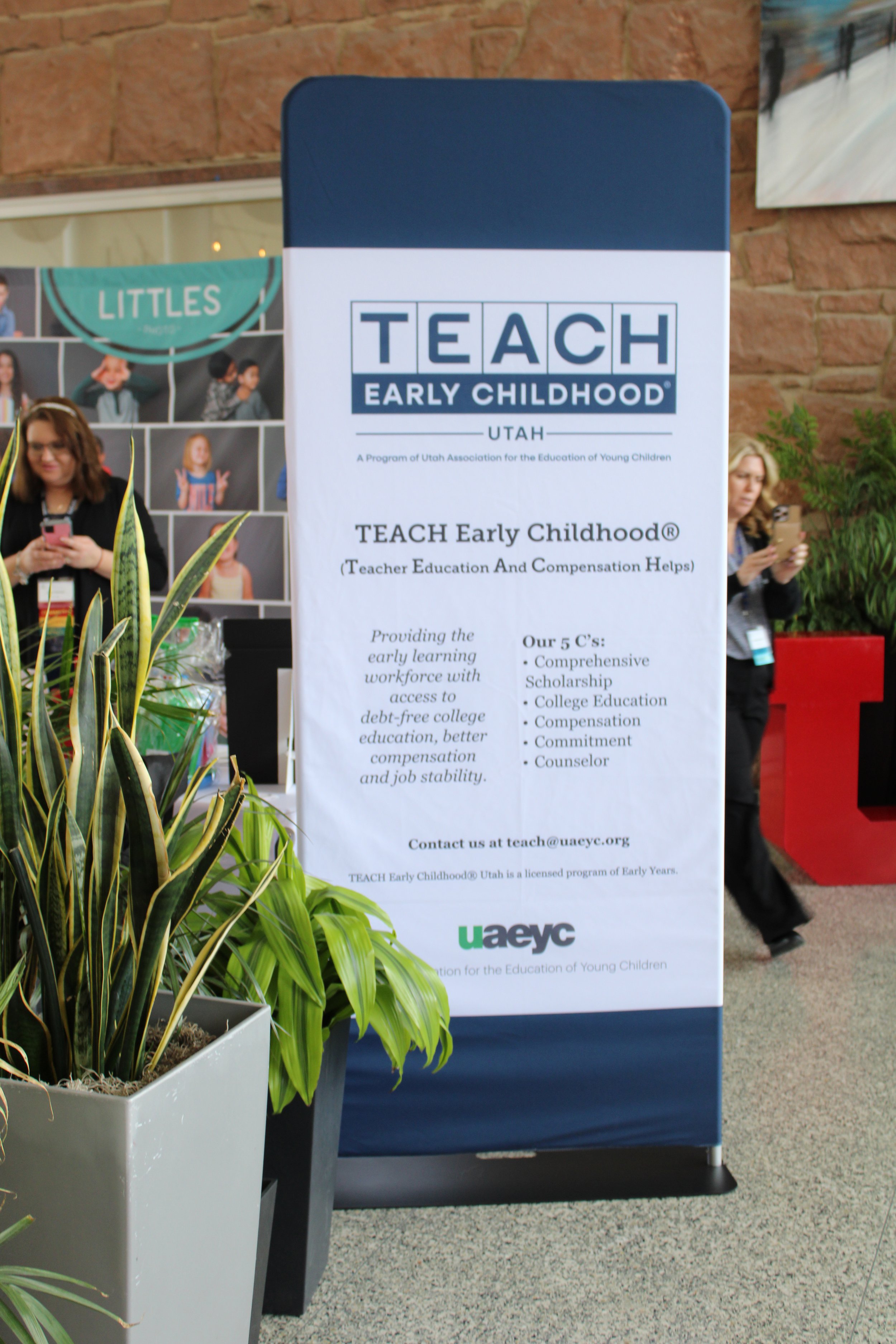
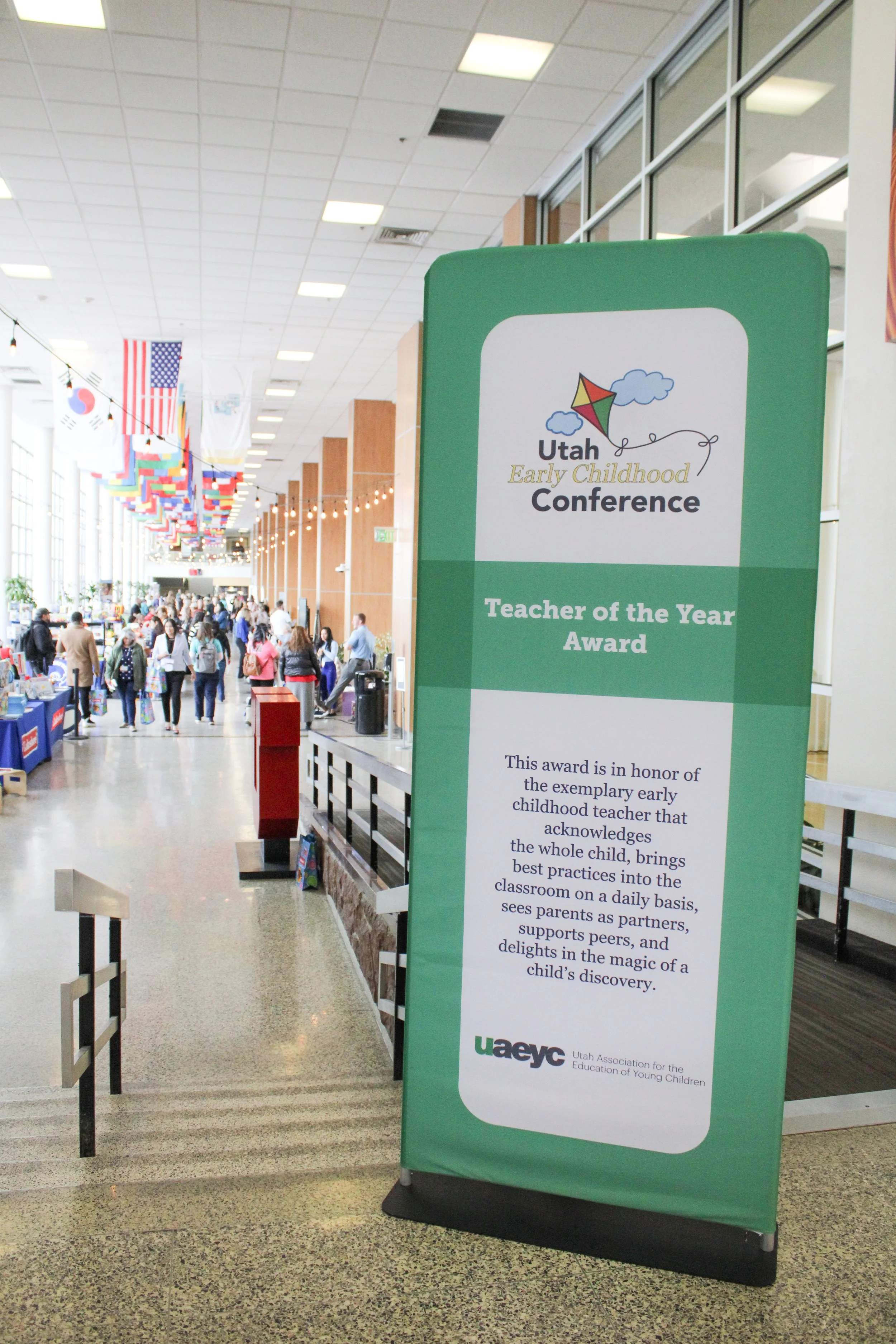
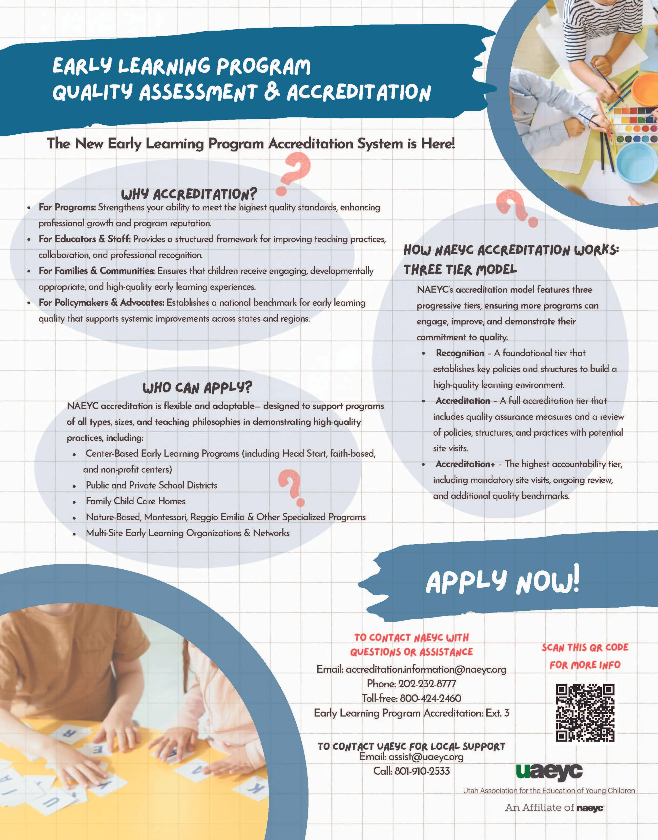
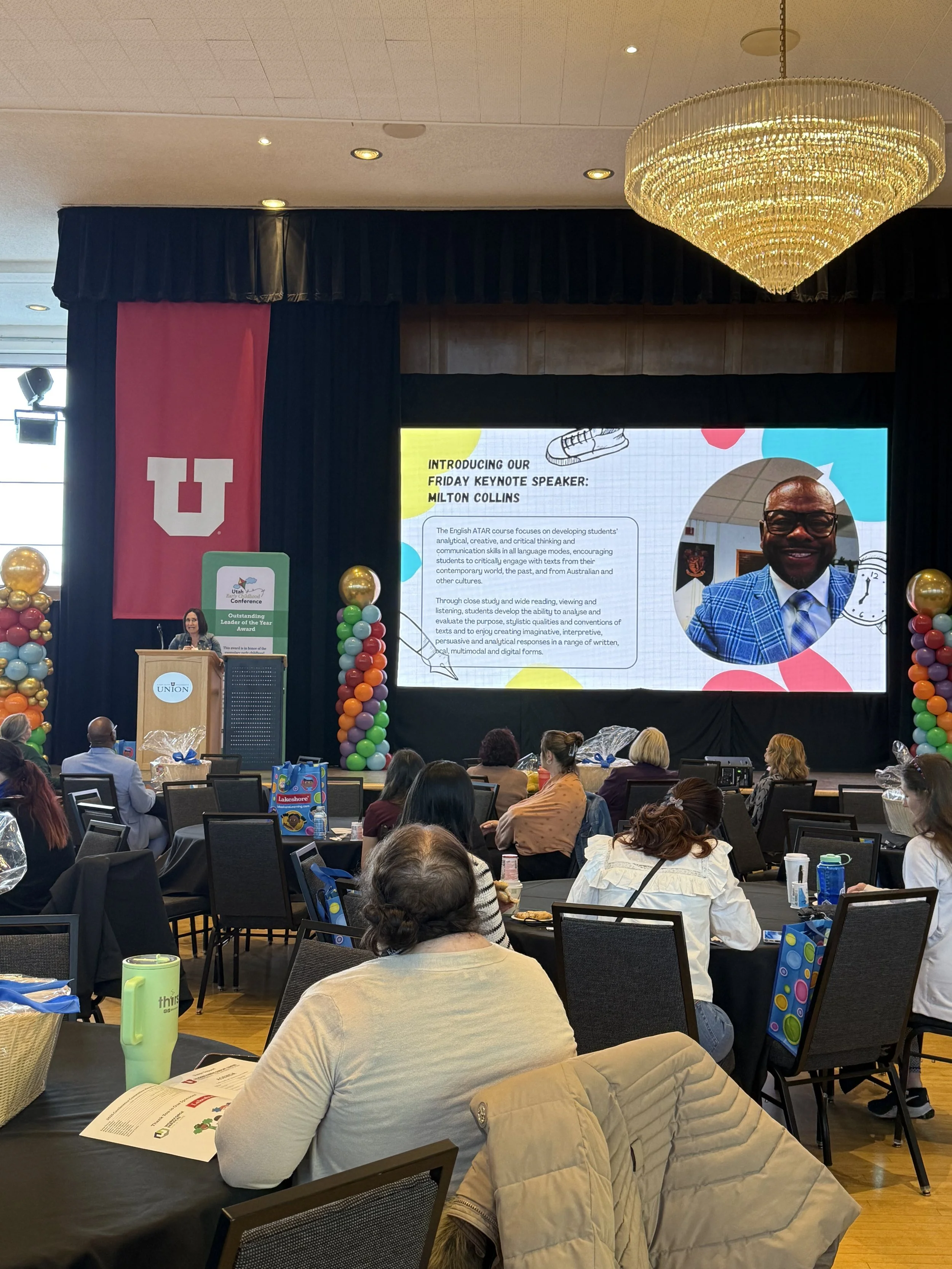
The Deliverables: A comprehensive rollout including environmental banners, a 20+ page conference program spanning over multiple days, main-stage award displays, social media campaigns, informational handouts, and keynote presentations.
Strategy: Information Synthesis & Scannability
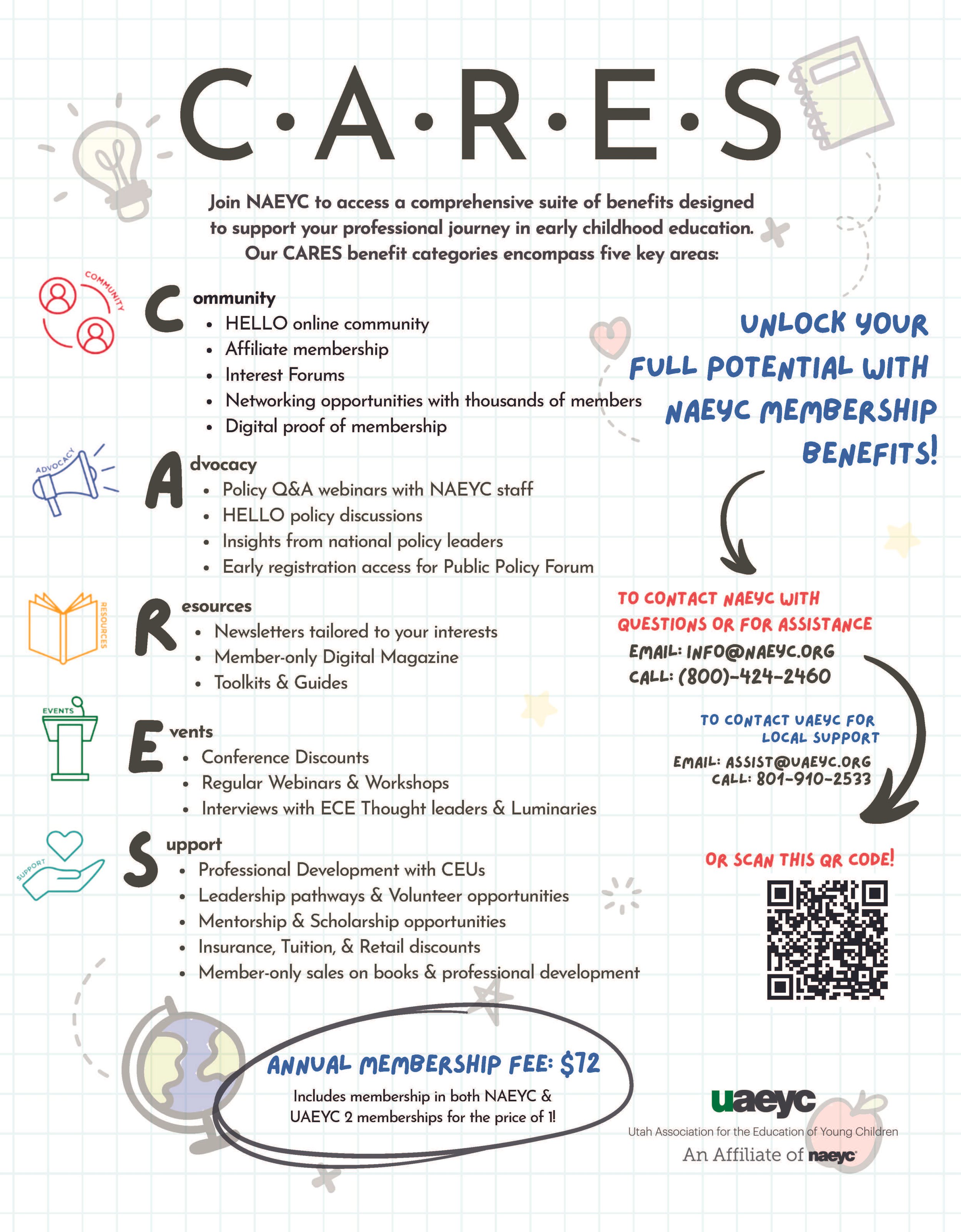
Faced with a dense schedule of workshops and campus maps, I focused on reducing cognitive load for attendees navigating a high-information environment.
Hierarchy of Importance: I utilized bold typography and oversized headers to facilitate "five-second scanning" for busy professionals moving between sessions.
Strategic Sequencing: I reorganized the program architecture based on utility. High-frequency resources (like campus maps) were placed at the front for immediate access, while time-specific schedules followed a chronological flow.
Navigation Systems: I introduced a clear Table of Contents and cohesive environmental signage that bridged the gap between the printed program and physical way-finding.
Execution: Bridging Play and Professionalism
The central design challenge was honoring the joyful nature of early childhood education while maintaining the rigor of a statewide professional organization.
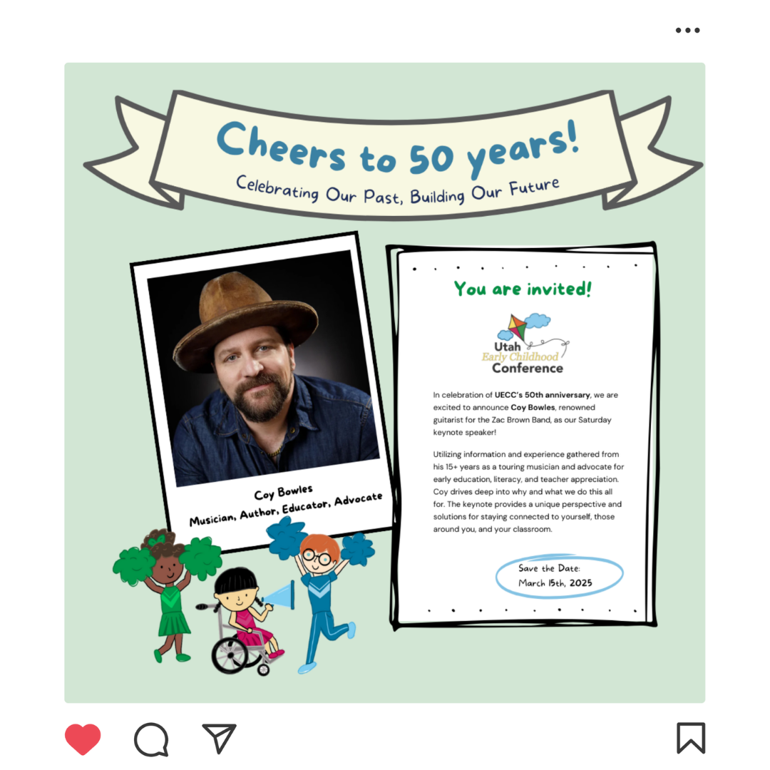
The 50th Anniversary Identity: I designed a custom "Cheers to 50 Years" anniversary mark. The visual metaphor anchored the theme: "Celebrating our past, building our future."
Inclusive Iconography: To honor the diverse demographic of Utah’s educators, I illustrated diverse skin tones, races, genders, and physical abilities within the custom theme graphics.
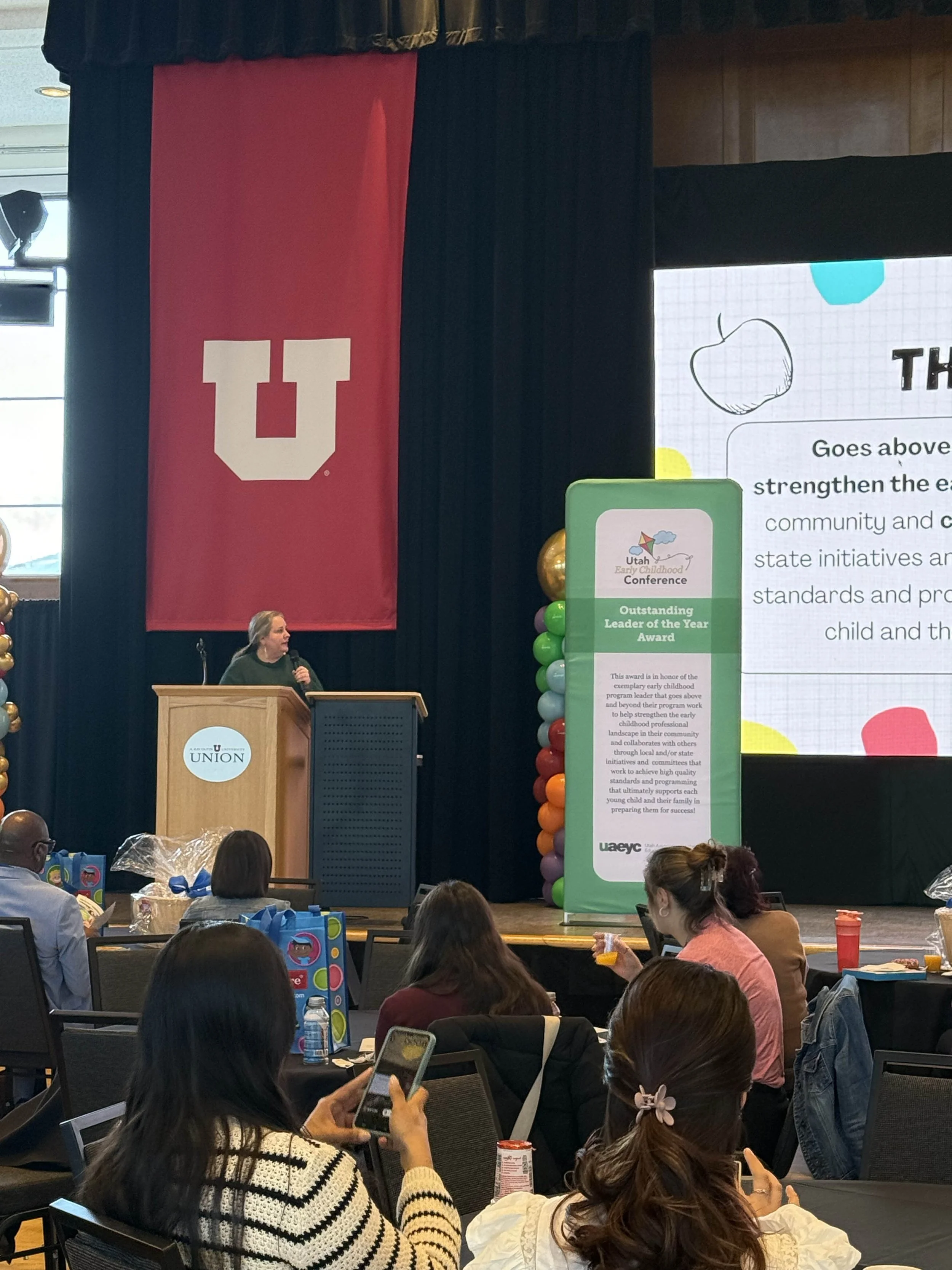
The Tactile Experience: I designed heavy-duty, professionally printed stage banners that doubled as functional backdrops for photography, significantly increasing the event’s "share-ability" and professional footprint on social media.
The Strategic Expansion
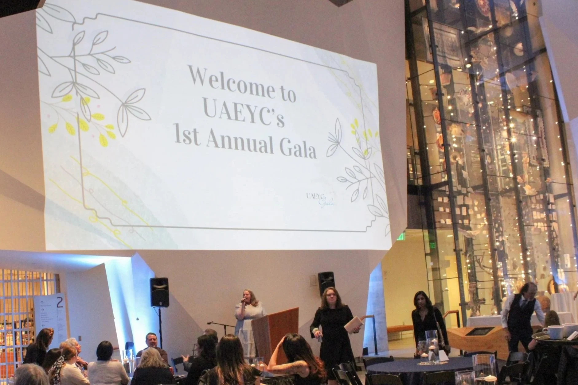
The Expansion: Creating a Foundation for the Inaugural Gala
While the conference required iterating on a 50-year-old brand, I was simultaneously tasked with building an original visual identity for UAEYC’s Inaugural Scholarship Gala. This formal fundraiser was a new venture for the organization, designed to fund higher-education scholarships for early childhood professionals.
Building from Scratch: Elegance Meets Mission
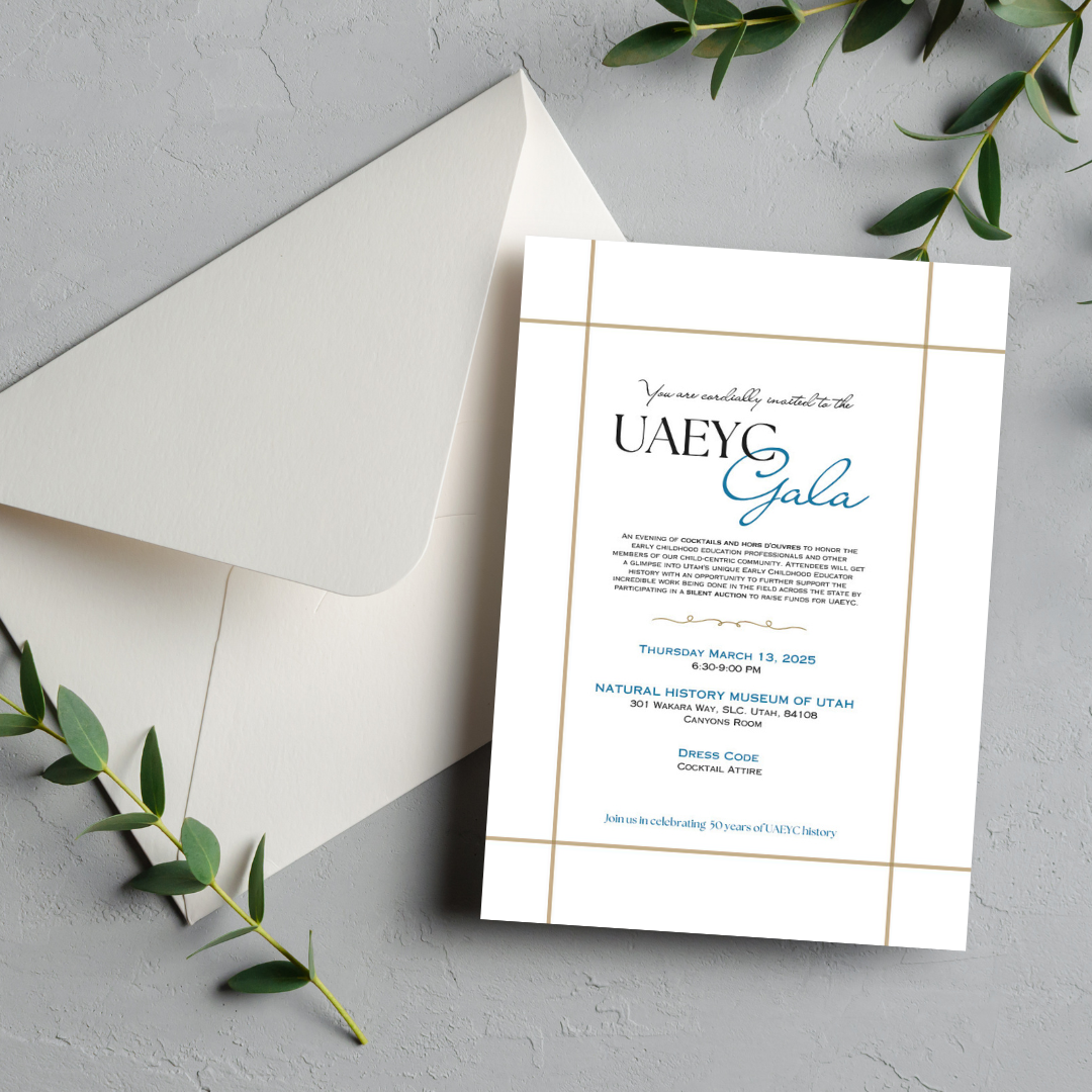
The Brand Architecture: I developed a sophisticated sub-brand that felt like a "premium" sibling to the main association. It needed to move away from the playful primary colors of the classroom and toward a refined, celebratory aesthetic suitable for a formal evening event.
The Visual Language: I curated a palette of Deep Indigo and Metallic Gold, utilizing high-end serif typography and minimalist motifs. This elevated the organization’s "trust factor" for high-level donors and stakeholders.
Deliverable Synthesis: I designed a cohesive "Gala Suite," including:
Digital Invitations & Save-the-Dates: Engineered for high engagement across donor email lists.
Print Collateral: Formal programs, menus, and signage that maintained brand consistency throughout the physical venue.
Impact Visuals: Custom graphics illustrating the scholarship's "Growth" mission, ensuring the emotional "why" was present in every touchpoint.
The Result: A Sustainable Sub-Brand
By building this identity from the ground up, I provided UAEYC with a reusable brand kit for what is now intended to be an annual tradition. This dual-track work—managing a legacy brand and a new launch simultaneously—highlights my ability to maintain visual integrity across wildly different audience demographics.
The Impact: Statewide Reach & Trust
This identity was deployed to educators from across the state of Utah, representing a local chapter of a major national association.
Professional Elevation: By replacing handwritten poster boards with a cohesive design system, the association increased its "trust factor" with both attendees and vendors.
Sustainability & Value: Environmental signage was engineered for multi-year durability, providing the non-profit with long-term ROI.
Streamlined Experience: By syncing the tactile program with the digital conference app, I ensured a seamless, omnichannel transition for attendees navigating via smartphone or print.