BYUtv’s Relative Race Season 12
TL;DR
Project:Relative Race (BYU TV)
The Problem: Translating a complex, multi-team challenge route in downtown Savannah into a simplified, brand-consistent physical map.
The Solution: A custom-illustrated wayfinding system that balanced logistical accuracy with high-visibility television branding.
Key Results: Enabled 100% successful navigation for contestants during a high-stakes "Day 0" challenge; maintained brand cohesion for on-camera close-ups.
Case Study: Physical Wayfinding & Cartography for Reality Television
Prop Design, Cartographic Illustration, & Production Coordination for BYUtv
The Challenge
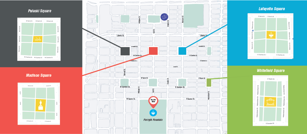
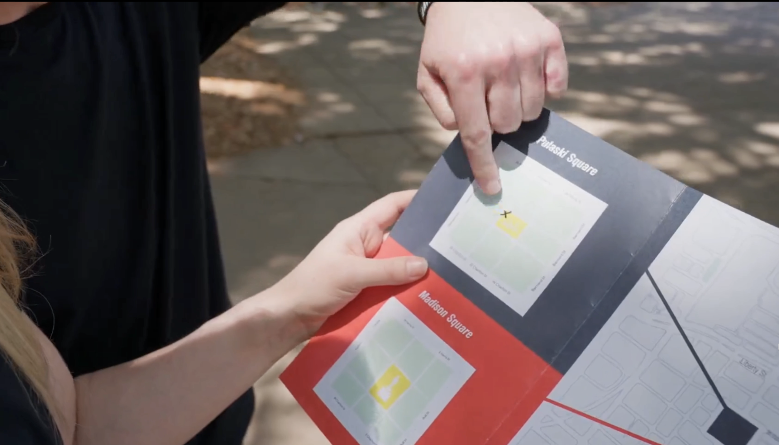
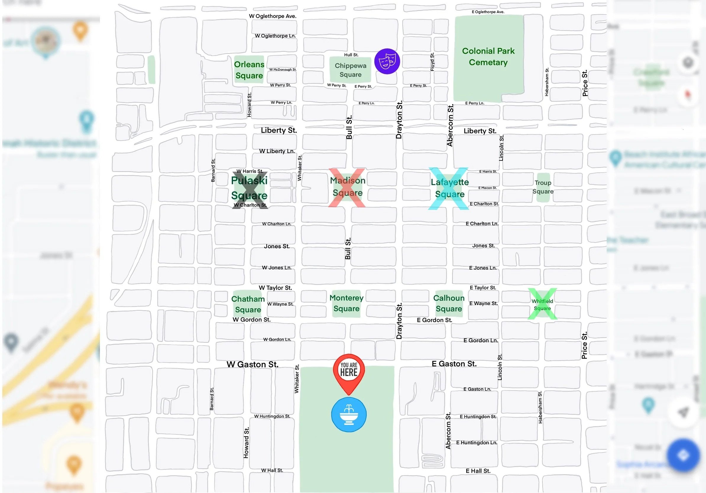
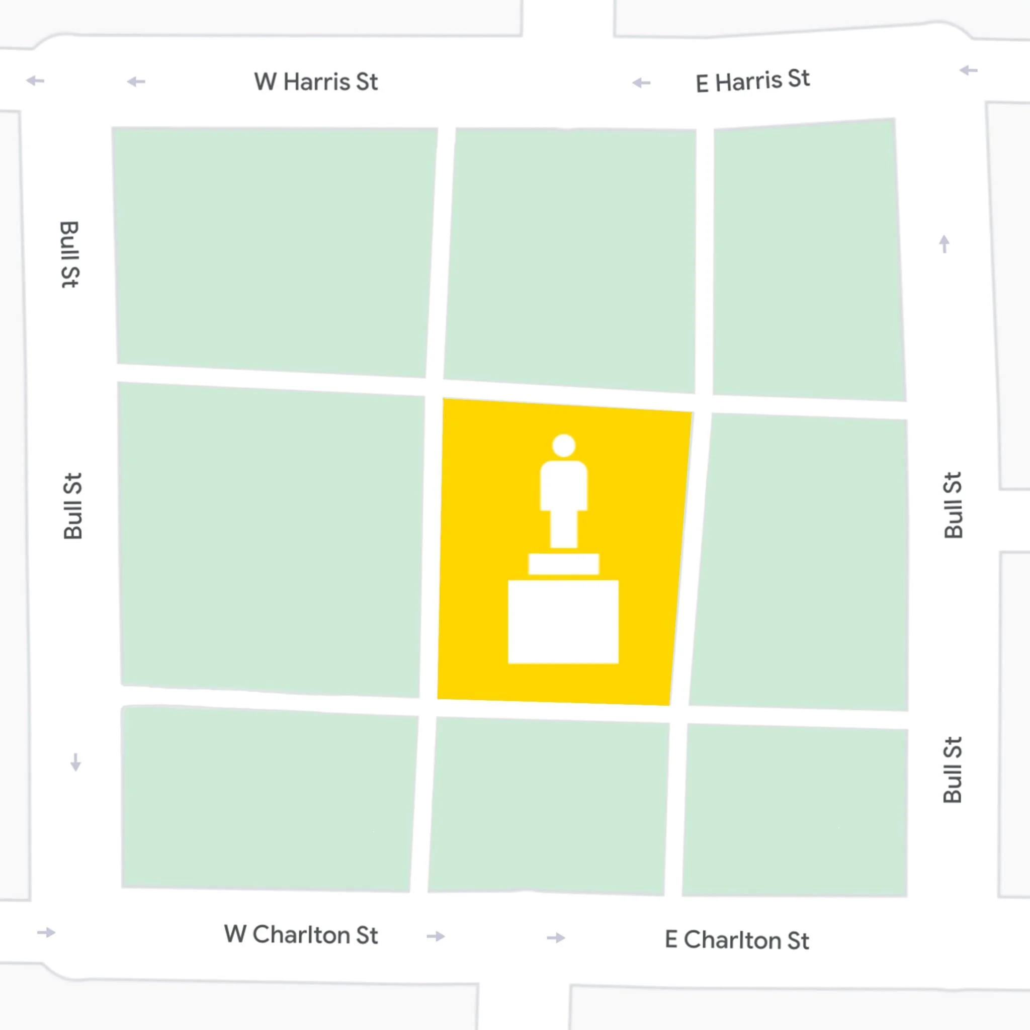
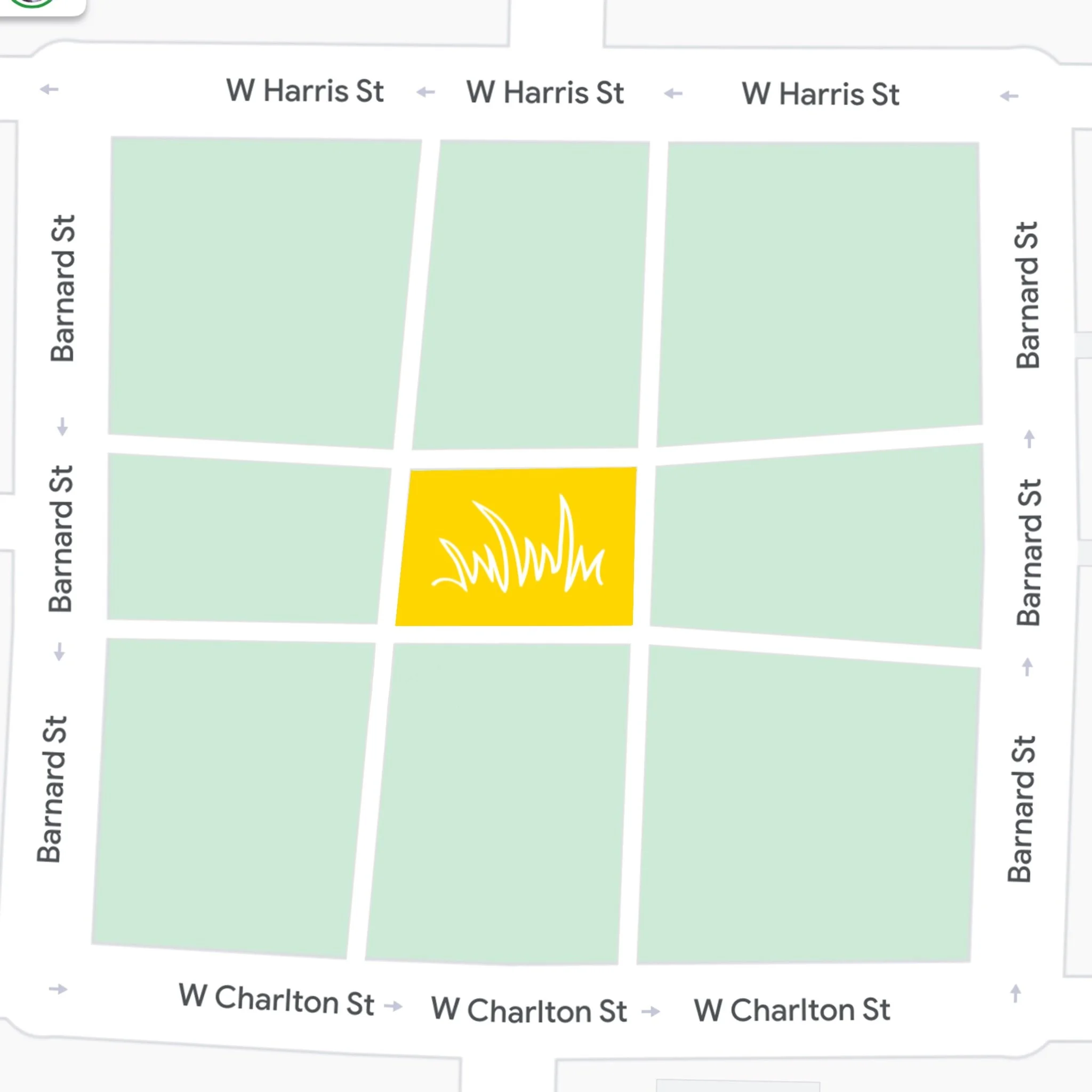
For the season premiere of a reality competition show, I was tasked with designing the primary navigational prop for the "Day 0" challenge in historic Savannah, GA. Contestants were required to use this map to navigate a complex grid of park squares to find their car keys and begin a cross-country race.
The Stakeholders: Challenge Producers, Camera Crews, and Contestants.
The Constraint: The map had to be functionally accurate to a historic city grid while remaining "camera-ready" and aligned with the show's established visual identity.
Strategy: Physical UX & Information Synthesis
Designing for a reality show is a unique UX challenge: the "user" is under extreme stress, and the "audience" needs to understand the map's logic at a glance through a camera lens.
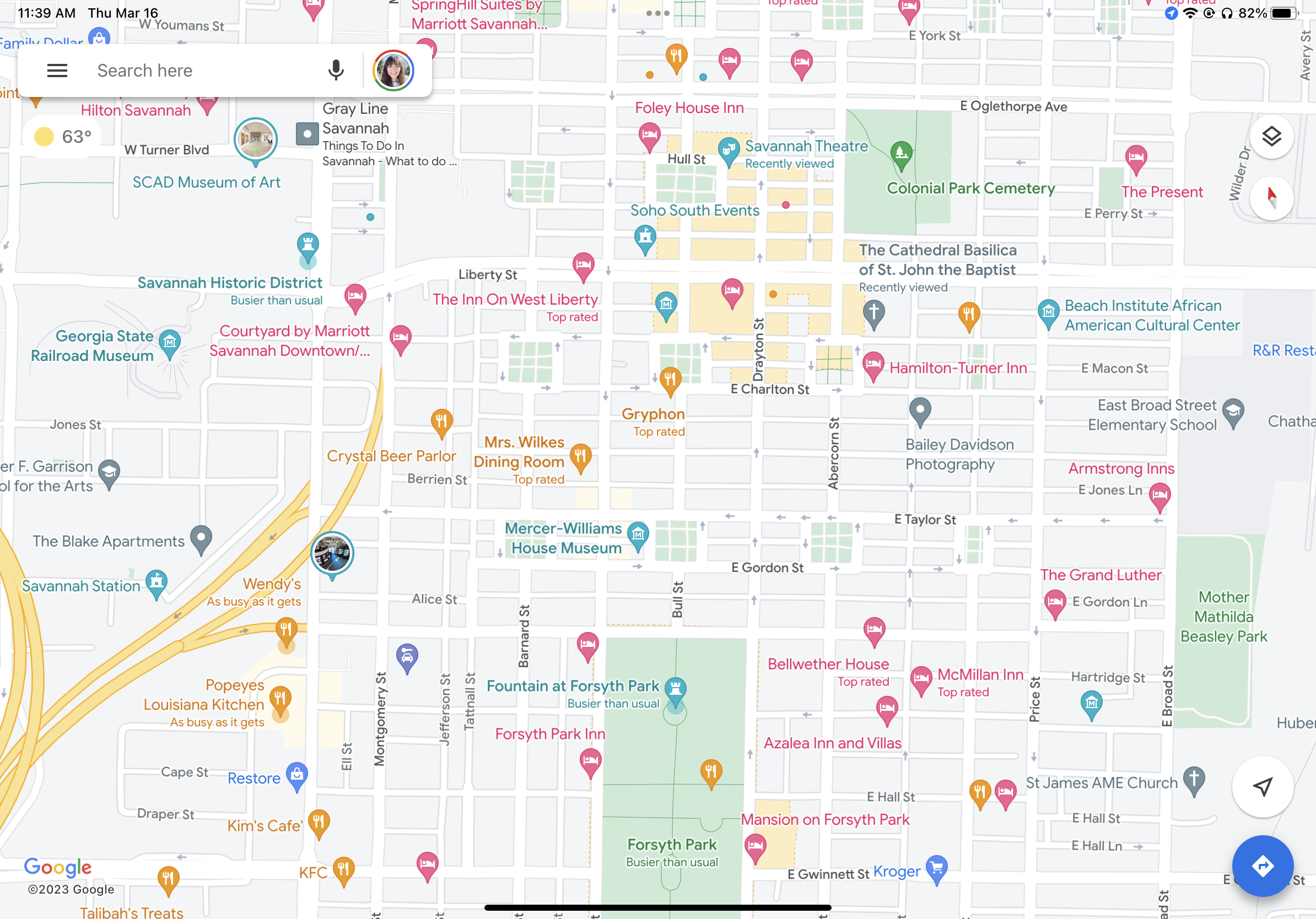
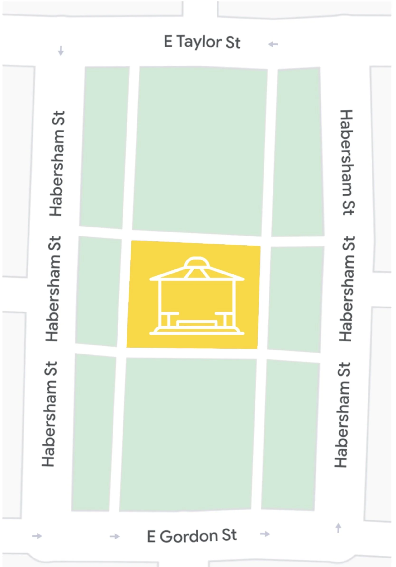
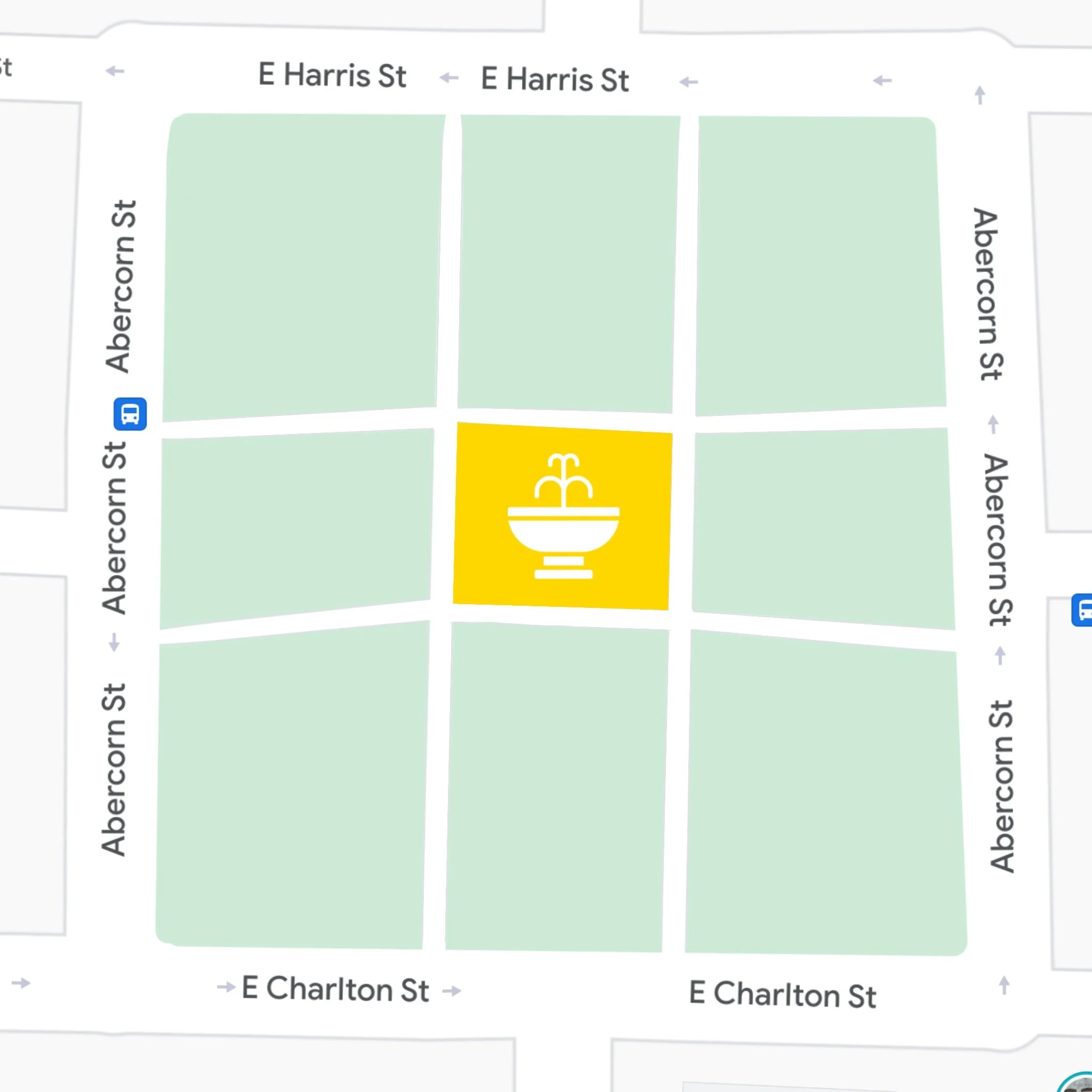
Simplifying Complexity: I took intricate geographic data from Google Maps and synthesized it into a simplified, illustrated vector map. I retained the scale and essential landmarks (The Historic Theater, the Forsyth Fountain) while removing visual noise that would confuse contestants in the heat of competition.
Multi-Path Logic: To ensure the challenge ran smoothly, I had to depict four distinct team routes on a single map. I used color-coding and custom iconography to ensure each team could follow their specific path without interference.
Agile Iteration: Reality production is fluid. As challenge logistics shifted—changing starting points or hidden key locations—I had to pivot the design in real-time, ensuring the prop remained a functional tool for the contestants and a reliable guide for the producers.
Execution: From Script to Screen
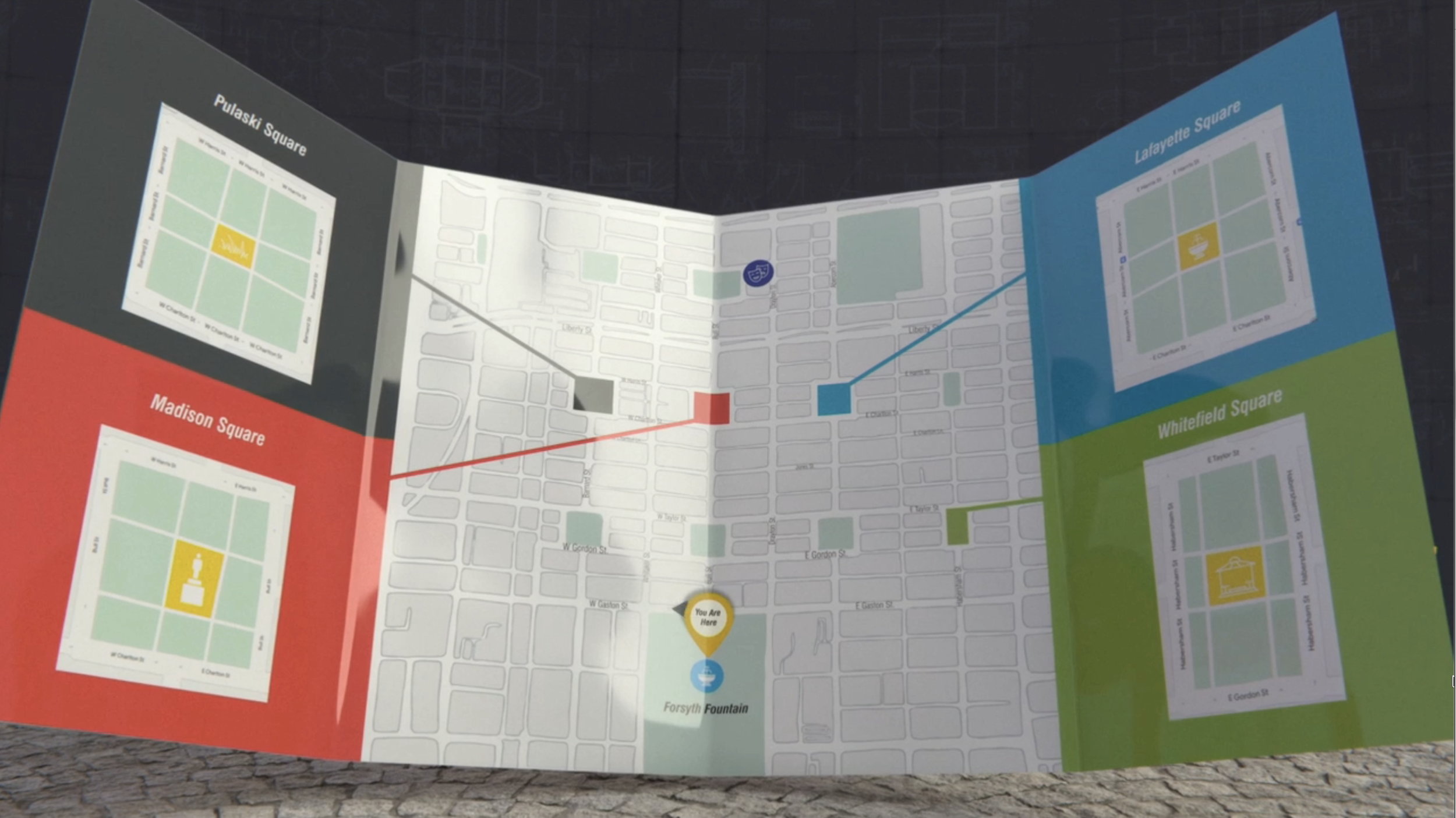
The map served as both a functional tool and a brand asset. It had to look "official" to the show’s world while meeting professional printing specifications for large-format physical use.
Brand Alignment: I integrated the show’s specific color palette, typography, and logo into the cartography. This ensured that during close-up shots, the prop felt like a native extension of the broadcast package.
Iconographic Wayfinding: I designed custom icons for Savannah’s iconic park squares and landmarks. These were not just aesthetic; they were "visual anchors" that allowed contestants to orient themselves quickly in an unfamiliar city.
Technical Precision: Working closely with the printer, I managed the bleed, margins, and scaling to ensure the final physical product was durable and legible under various lighting conditions on set.

The Impact: Seamless Production
The map successfully guided all teams through the historic district, leading them to their respective car keys and the start of the race.
Functional Success: Zero navigational errors during the challenge, proving the clarity of the wayfinding system.
Production Synergy: By acting as both the Production Coordinator and Graphic Designer, I was able to bridge the gap between logistical needs and visual execution, ensuring the prop was compliant with both the "Script" and the "Screen."